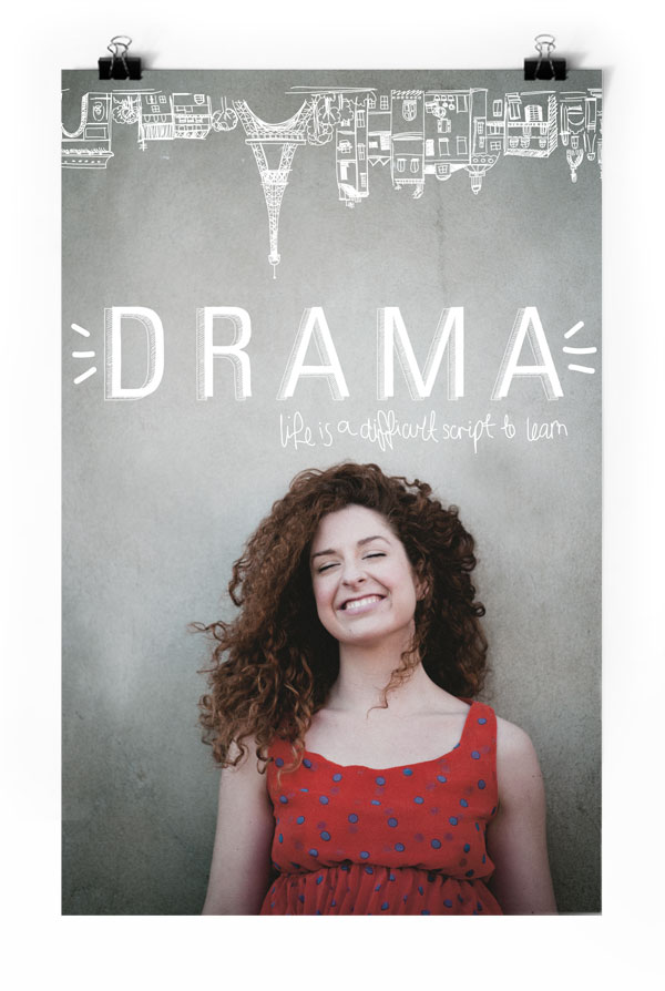
DRAMA is an indie film currently in production. I designed this poster well before the movie had started filming so these guys could get funding and get off to a good start. Currently filming in Paris these guys are the next big thing to hit our screens so keep an eye out.
New Work: Punters’ HQ Landing Page
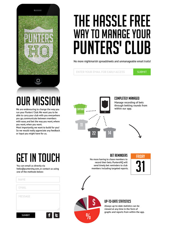
After doing the Punters’ HQ branding earlier in the year I was happy to join these guys again in designing a landing page for them. Luckily these guys are web developers and were happy to do the coding themselves so I can only take credit for the actual design. If you are part of a punter’s club this is for you! www.puntershq.com
New Work: Fusion Building Solutions
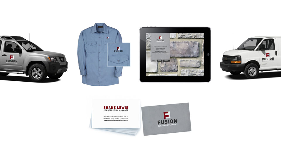
Fusion Building Solutions is a new company that started in 2013 in Coffs Harbour NSW. I did the full branding and rollout for these guys. I’ve used a concrete texture on the business card and couldn’t resist ‘fusing’ the letter F together for the logo.
New Work: Lord of the Flies
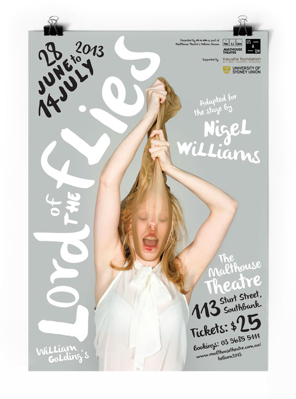
Lord of the Flies is a story driven by a battle for power. It is about a clash between the two halves of the human mind: the civilized and the wild. Us-A-Um’s production of Lord of the Flies will be performed with a complete female cast. With these two thoughts in mind, and the strong photography provided, I wanted to come up with a design that was a bit rawer but with hints of femininity through typography.
New Work: Milk Crate Theatre | Annual Program 2013
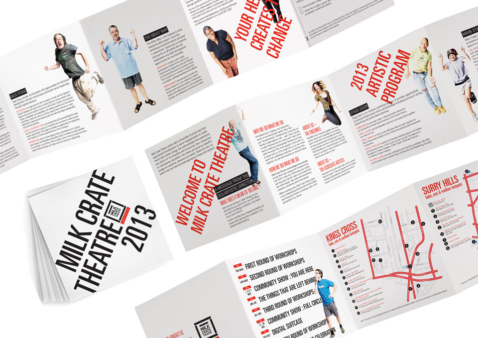
Milk Crate Theatre works with an Ensemble of artists who have experienced homelessness or social marginalisation to create theatre that creates change. I love working with these guys to create fun designs and help them get their message out there! I designed their 2013 Annual Program of events and workshops for more information on this great not-for-profit organisation visit www.milkcratetheatre.com
Illustration… just for fun
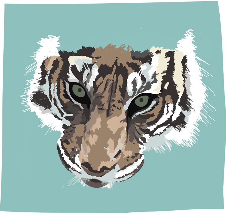
Just playing around with my new stylus, iPad mini and the Adobe Ideas app… It’s pretty fun. Tiger time!
New Work: Bowerbird Weddings
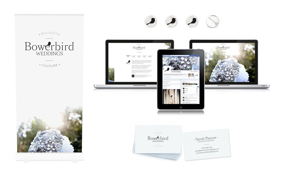
Bowerbird Wedding’s is a new business that recently launched in Newcastle by my good friend Sarah Pascoe. I came on board to help Sarah out with her branding, logo, website, stationary and social media marketing elements. Bowerbird Weddings specialises in Brooch Bouquets, a new trend in the wedding industry. I branded the business with the Bowerbird which is renowned for constructing beautiful nests decorated with collected pieces including brightly coloured objects, things that sparkle and are pleasing to the birds eye… If Sarah were a bird she would be the Bowerbird!
I’d also like to give a shout out to Joanne Wallace of York Arthouse who supplied the beautiful product shots.
New Work: A fun little postcard for the UVS team
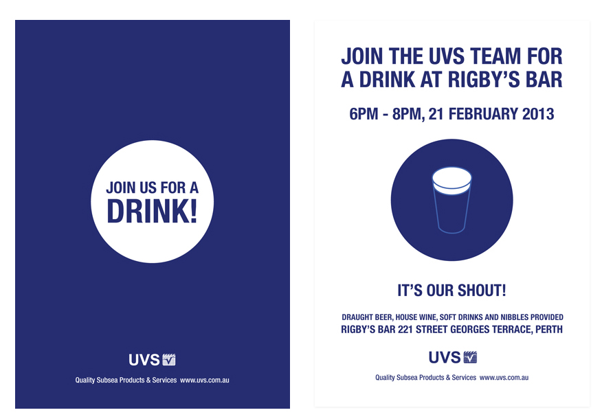
UVS are great clients of mine that are based in Newcastle, they needed a postcard that their staff could hand out to at a conference/expo this week. I whipped this up for them and I really like the simplicity of it.
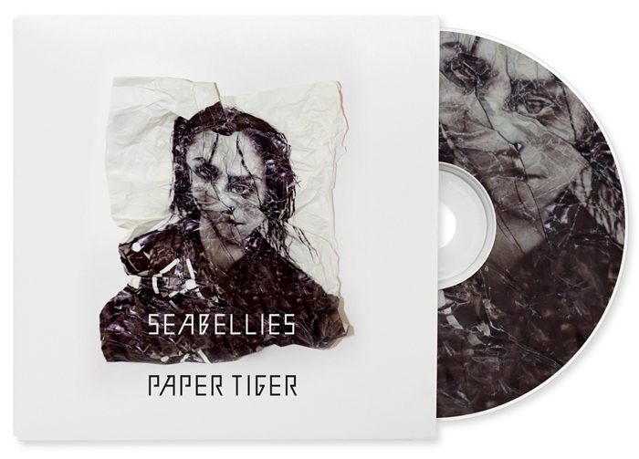
New Work: Paper Tiger Album Art
The Australian band Seabellies launched their first single ‘Paper Tiger’ from the their new album this month. I was lucky enough to work with them in designing the cover art. The band was after something different from their usual artwork and asked for something a bit ‘darker’. Here’s what I came up with… it’s surprisingly hard to scrunch the paper in just the right way.
Check it out, Listen and buy on iTunes to support this great Aussie act.
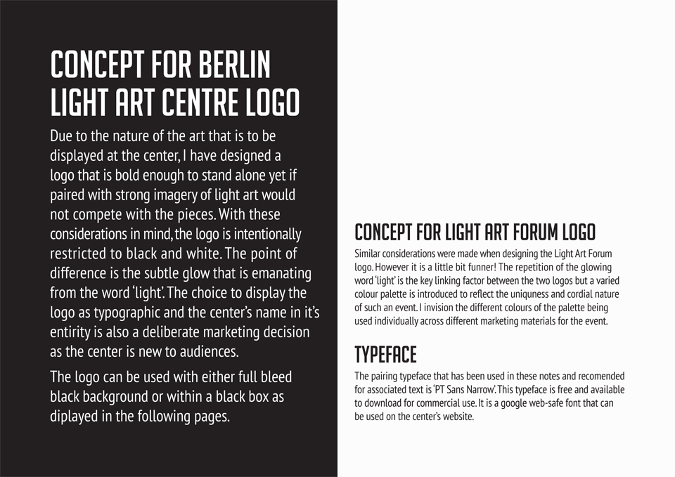
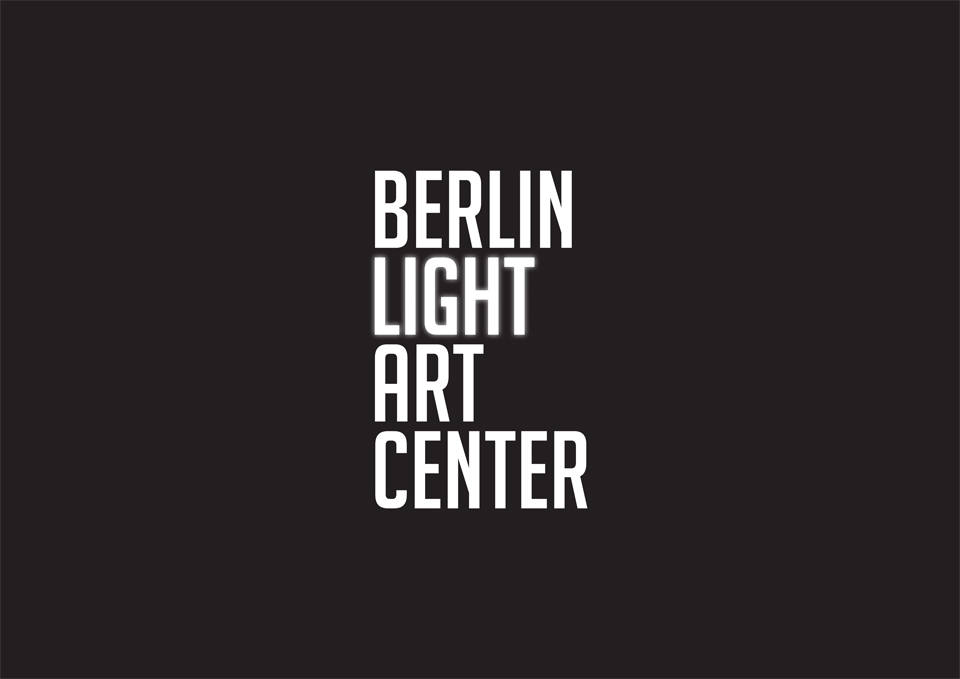
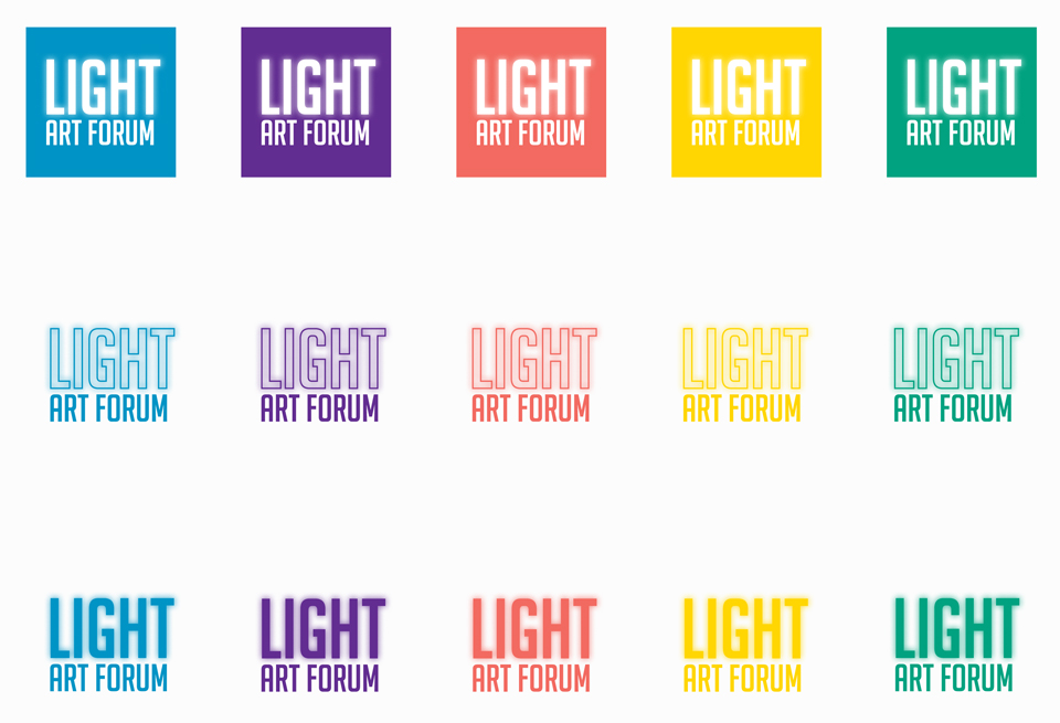
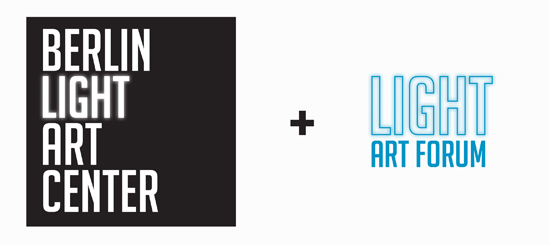
Pitch : Berlin Light Art Centre and Light Art Forum Logos
This design was pitched to a new art centre opening up here in Berlin next year, I received great feedback for my designs… hopefully I’ll be invited to the opening!
The brief was “We are striving for creativity and a vision for the future of the center. Ideas should be fresh, bold and capture the essence of light and art in one vision. Focus on block colours orange, blue, green, yellow and black and white. Please incorporate text with logo….Please avoid using any dots, light bulbs, rainbows, 80’s or retro. The LAF logo should complement the BLAC logo.” Here’s what I came up with: